EYE ON DESIGN
Eye on design
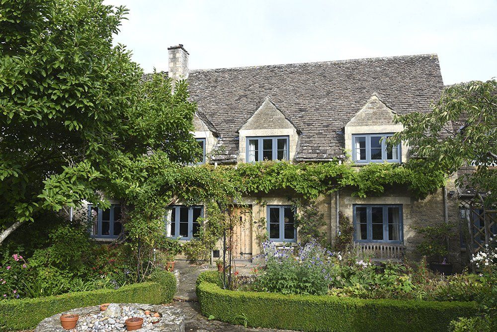
Despite appearances, this former barn has no listed sta tus, nor does it sit within a conservation area, but this didn’t stop Mr & Mrs Spivey recognising how poorly suited the 1970s windows were.
Converted for residential use in the 1940s, the couple took ownership of this Gloucestershire village home just one year ago,
“the windows were the first job on the list”
they explain.
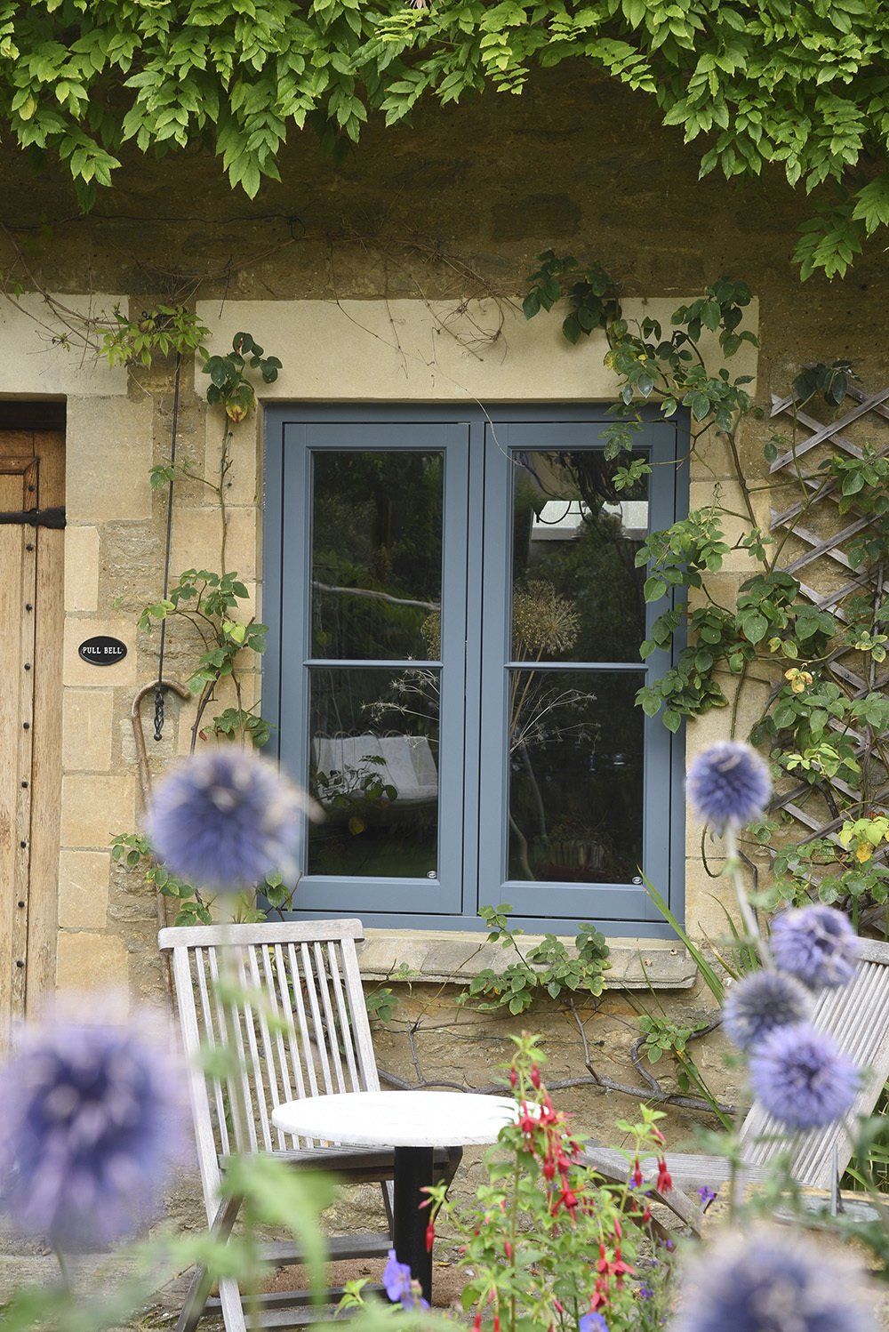
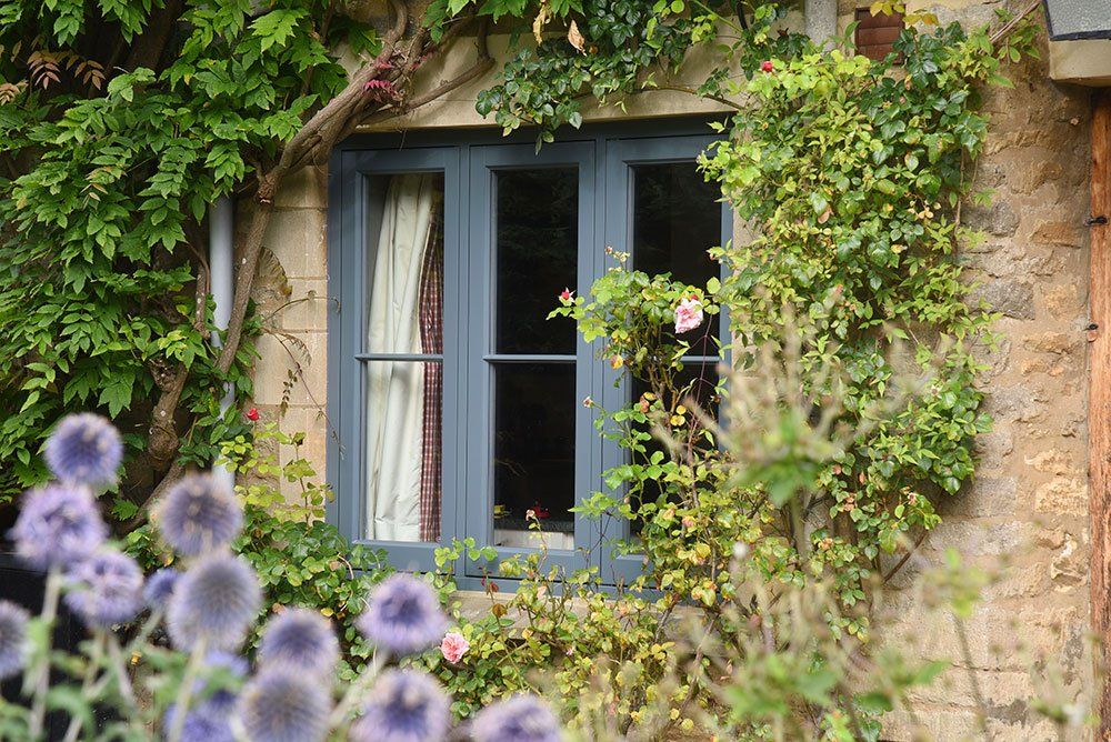
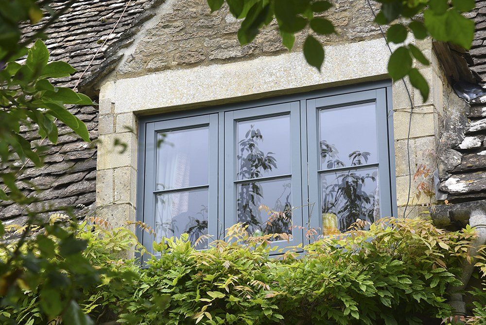
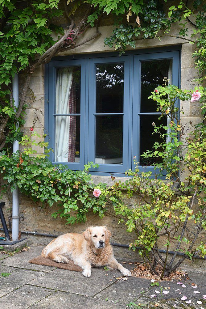
BALANCED SIGHTLINES
“We are thrilled with the changes!”
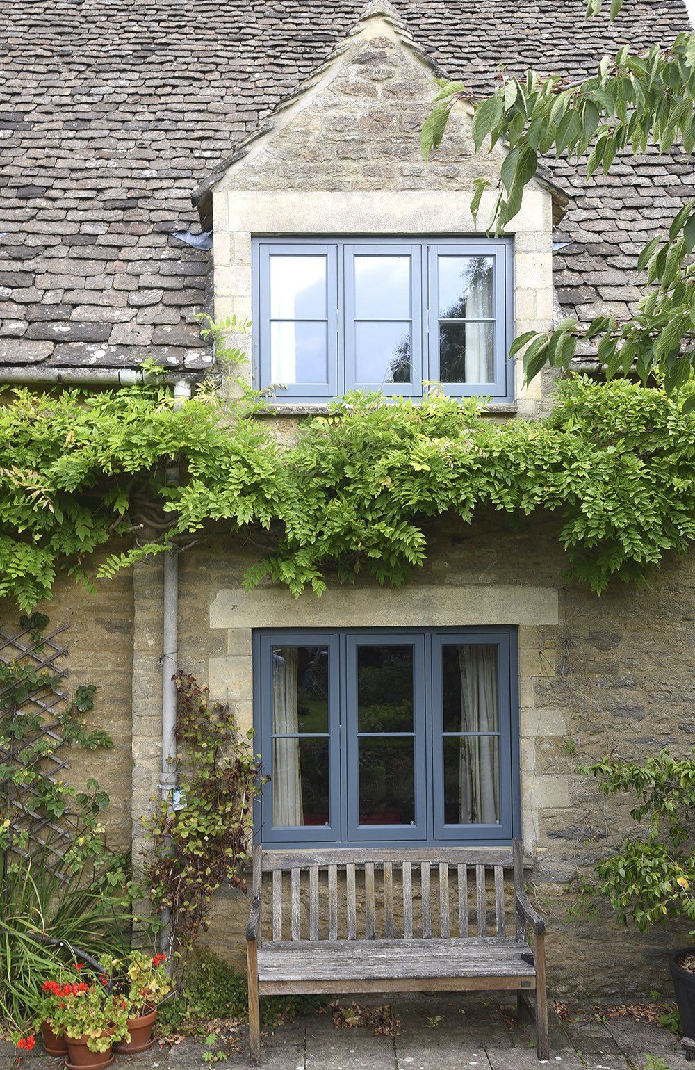
Urbane Grey flush casements with a single, fine astragal glazing bar give balanced sightlines; and it’s not just the homeowners that have noticed,
“Neighbours and friends have commented on what a lovely choice and the difference it has made.”
The colour of Urbane Grey crosses between a shade of grey or blue depending on how the light hits the frames.
The proportions make all the difference; getting the height to width ratio correct along with the ideal number of panes, are all key to a balanced look.
IN THEIR OWN WORDS, OUR CUSTOMER'S REACTION
“We really feel like we’ve put our stamp on the house now.”
“Windows are so important to a house; they are the eyes.”
“Friends and passersby are glad to see the back of the chunky, white plastic frames!”
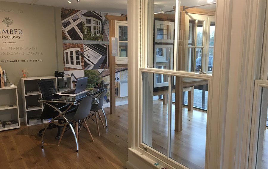
The nearby Cirencester showroom impressed the homeowners, “the team were excellent and the product options were well demonstrated.”